Control Panel Reskin
I wrote a bit about this on DreamHosts blog but I’ll go into more detail here. I started at DreamHost in 2012 with one huge, personal goal. We need to fix the hosting control panel.
What I didn’t realize was how huge of a project that would be. We tried on three different occasions to plan out how to tackle it. A complete, ground-up redo would take years to see the light of day. A slowly-but-surely redesign was attainable but very incremental. What do we do?
We do the later. As they say, ship early and often. So I created a plan of attack. Divide out the most common sections of the control panel based on usage and value to our core services. Redesign in chunks. That makes sense. But now what? Where do we start?
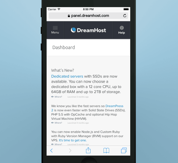
We decided the first phase of the project was to redesign the wrapper of the control panel. The header and navigation. The panel “chrome”. This would give us time to put the groundwork in place to for the rest of the phases. We can build it to be responsive, so that as we redesign other sections responsively it Just Works™. We can build out our fledgiling pattern library. We can focus on removing distractions from the page content. Yeah. This sounds good. Now what?
Start at the end
You can't start building the walls of a house if you don't know the floorplan. The first thing we started with was to figure out what the end goal of this project would be. What does a redesigned control panel look like? How is it organized? How can we streamline the user flows so that we're not forcing customers to sift through a wall of links and buttons?
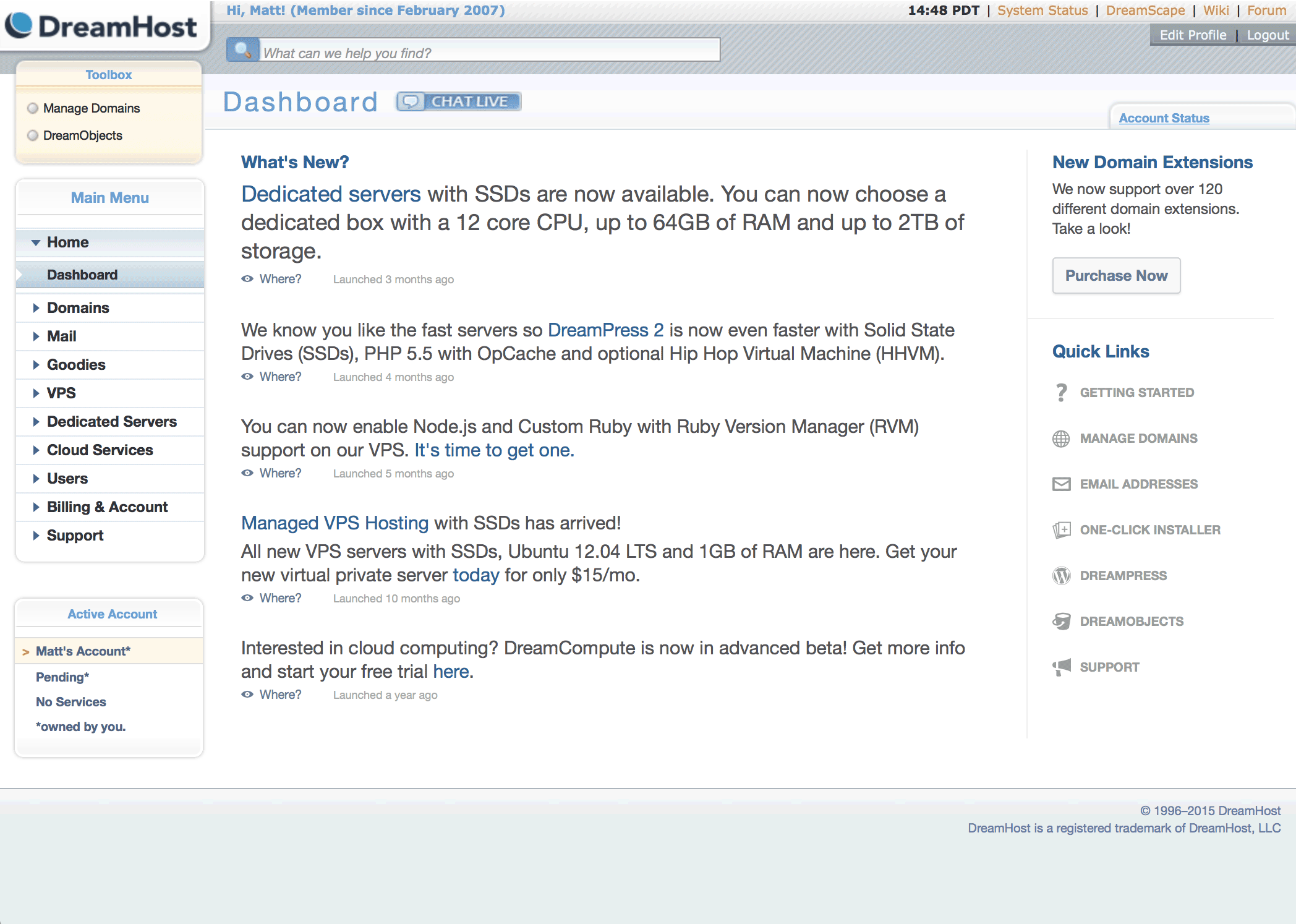
We mapped out the heirarchy of our control panel. There were 75 different top level navigation links, the epitomy of a flat architecture. We ran a card sort exercise and were able to condensed that down to five main sections. Domains, Servers, Cloud, Account and Support. This allowed us to work with increasing findability of features by grouping them.
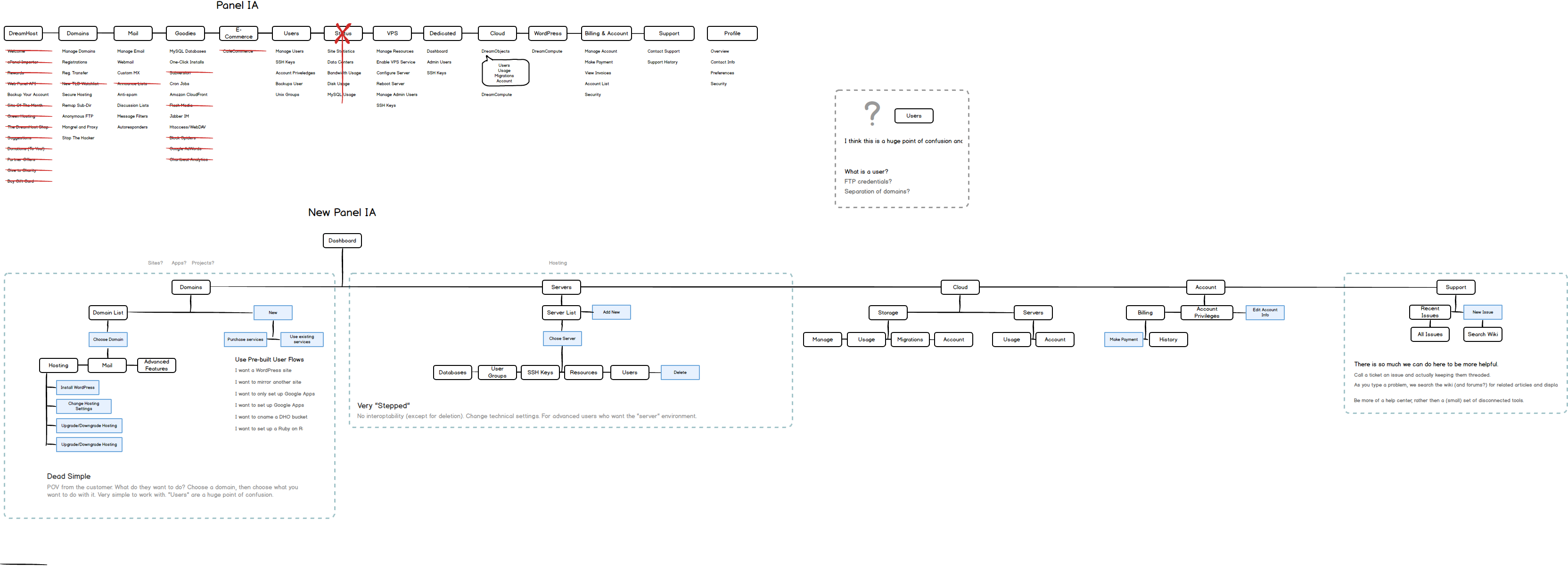
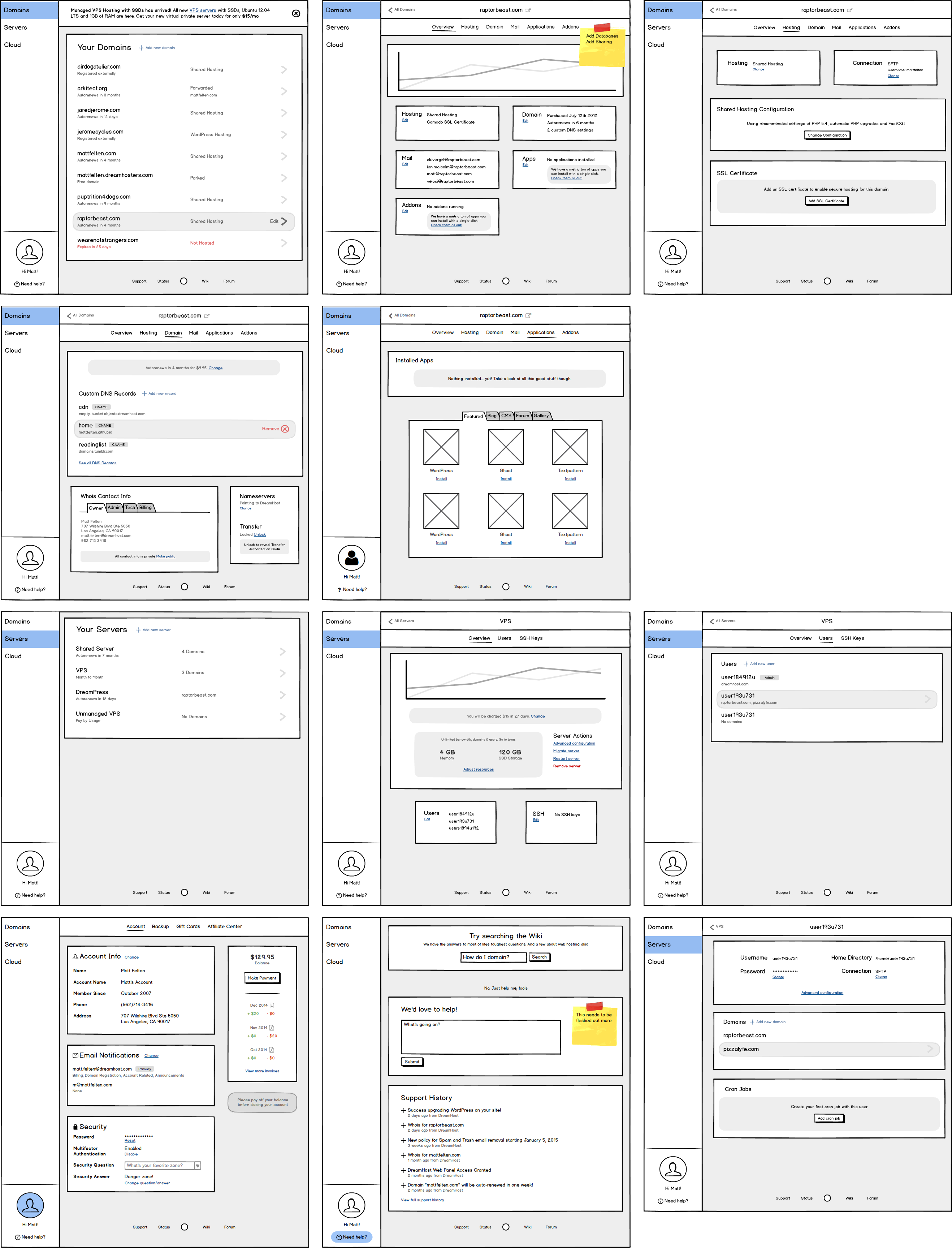
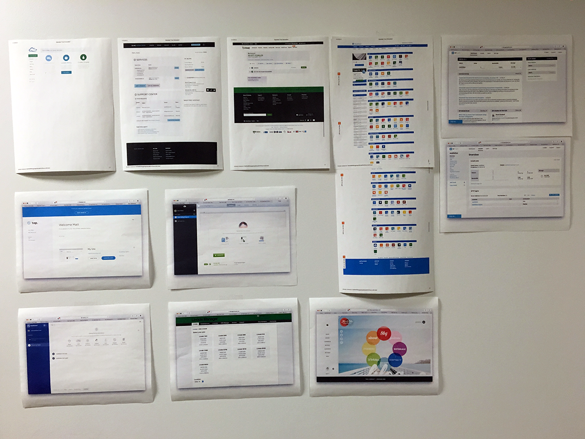
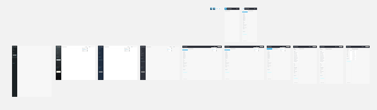
Once we had this new architecture, we did some quick wireframes to help explain the idea. These were in no way final but we created them to get a shared vision of what we can turn the control panel into and run user tests on. We made a really nice prototype using all our wireframes and Invision to walk stakeholders through.
Now that we have a good idea what we're planning on getting to, we can start working on design the shell of the app to support this design. We can work on patterns that support this new tiered heirarchy.
Navigation design
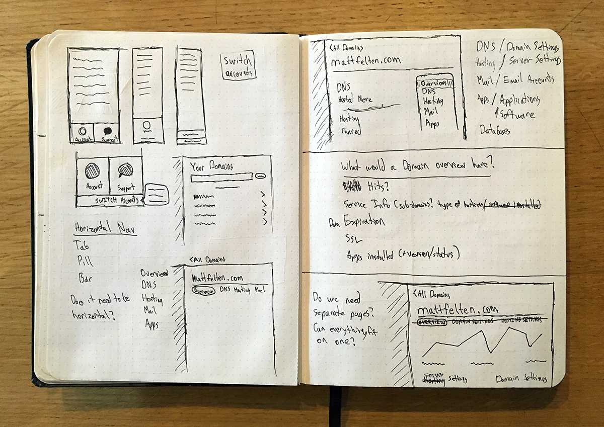
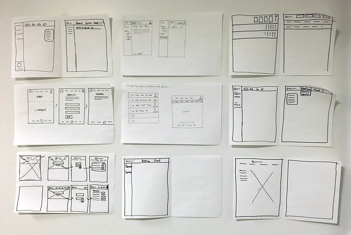
The hardest part of this project was working on the navigation structure. With a tiered heirarchy, we need solid patterns for secondary and tertiary navigation systems. Those are things we haven't really needed in the past so we spent some time figuring out how we can lay out navigation systems.
Once there were a number of options to sift through, we did competitor research. How are other apps solving this propblem? We did a few group sketching exercises also to get the juices flowing and get some quick group-think on our side.
Details
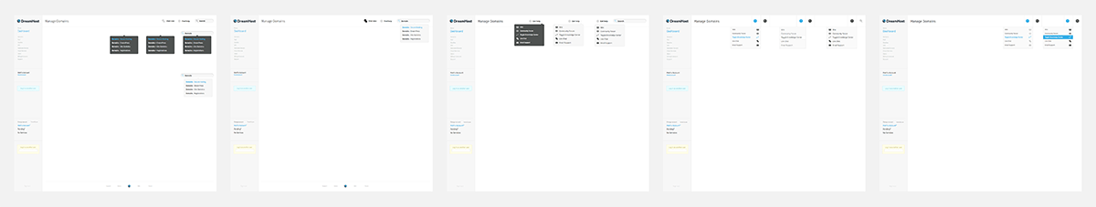
Here's the fun part. Time to dive into the visual design portion of this project.
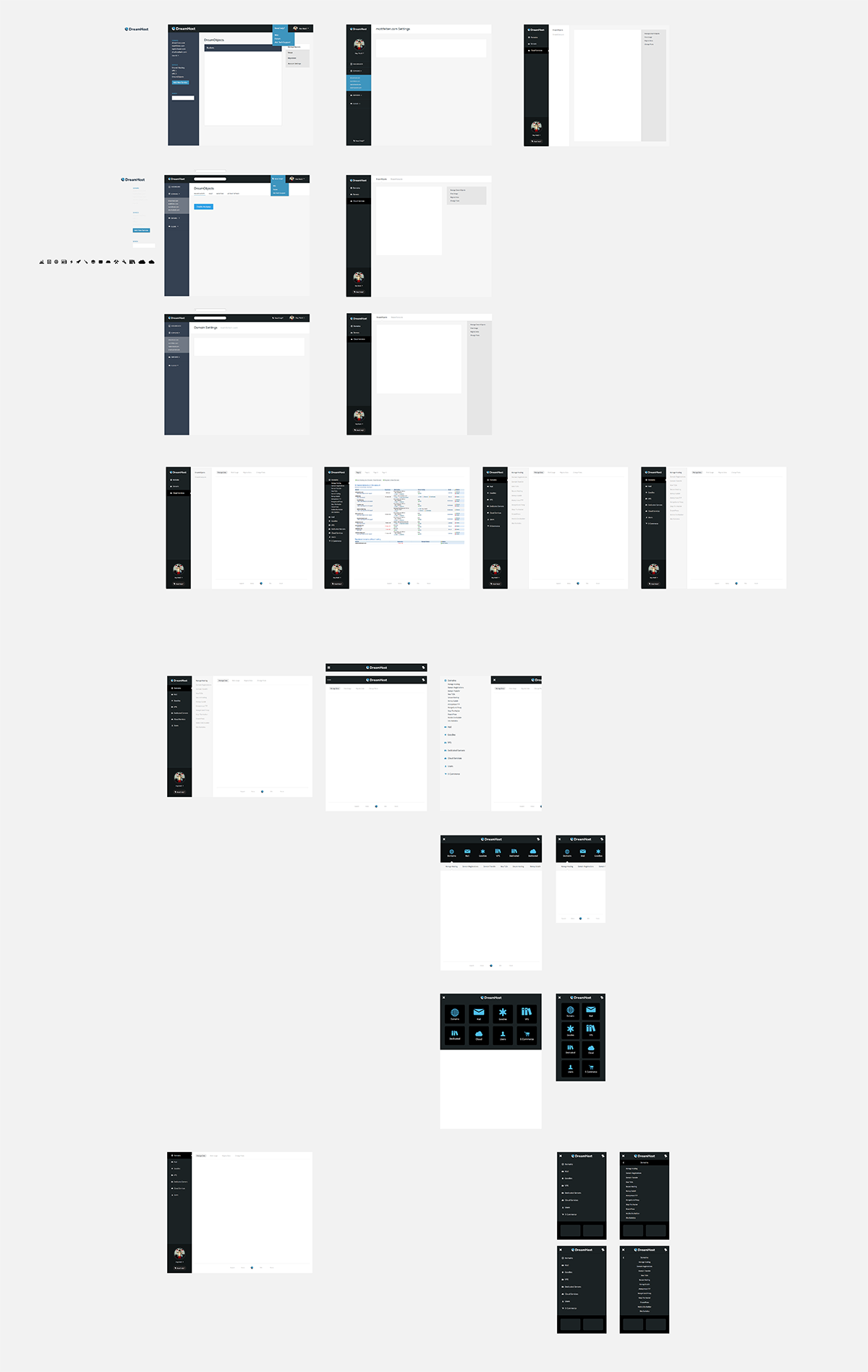
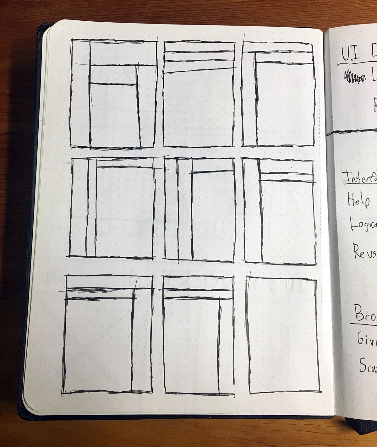
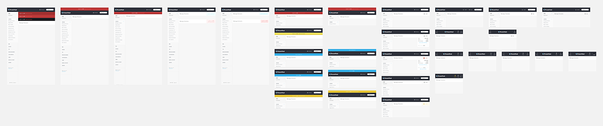
Iteration is paramount for a project this large. I spent a lot of time focused on layout and structure. Then switch up focus to aesthetics, type and color. Build out a prototype and test it. Find the flaws and do it again.
After about four rounds of doing that, something started to happen. We started getting to a place where it was all coming together. Now I could focus on the details. How do dropdown menus work? Where and how does our employee-only functionality appear? Focusing on each one of these questions in a short design spike let us focus on small, specific problems and smooth out the edges of the complete design.
Launch!
Even though we were testing this project throughout the design process, once the team was satisfied that we were hitting all our goals, we ran internal tests. We had a number of people from other teams use the new panel design as their primary interface. We kept track of all the feedback and fixed any bugs that arose. And then flipped the switch.
This was such a long, exhausting, rewarding and incredible project. It took about 8 months, start to end, working on it in between other projects. I learned about the true meaning of iteration, designing variations until you can't think straight anymore. I also learned a lot about project management, setting launch dates, and all the peripheral work that goes into launching a product.